![](https://cdn.myportfolio.com/d2e35a92-8738-49c9-ac77-0d093d17d1e9/5888a619-e432-45b7-8738-b0f18e9cf5bd_rw_1920.jpg?h=d4073d1e0d832bfb8096bea0b003bf3d)
Scorched
2020
Seattle, Washington
Branding
Creative Direction
Logo & Identity
Naming
Packaging
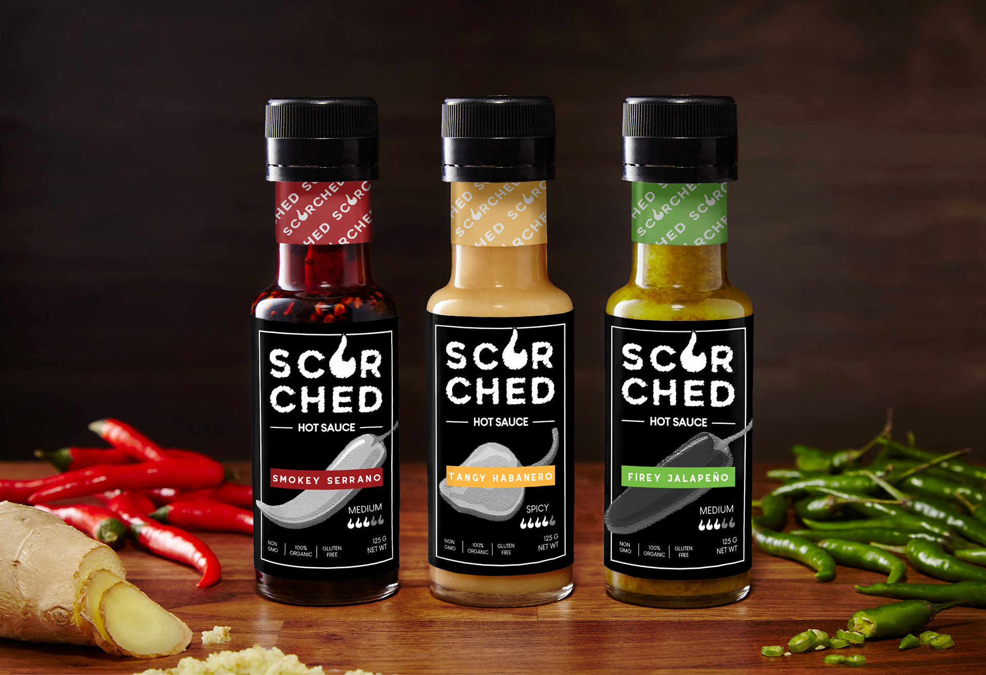
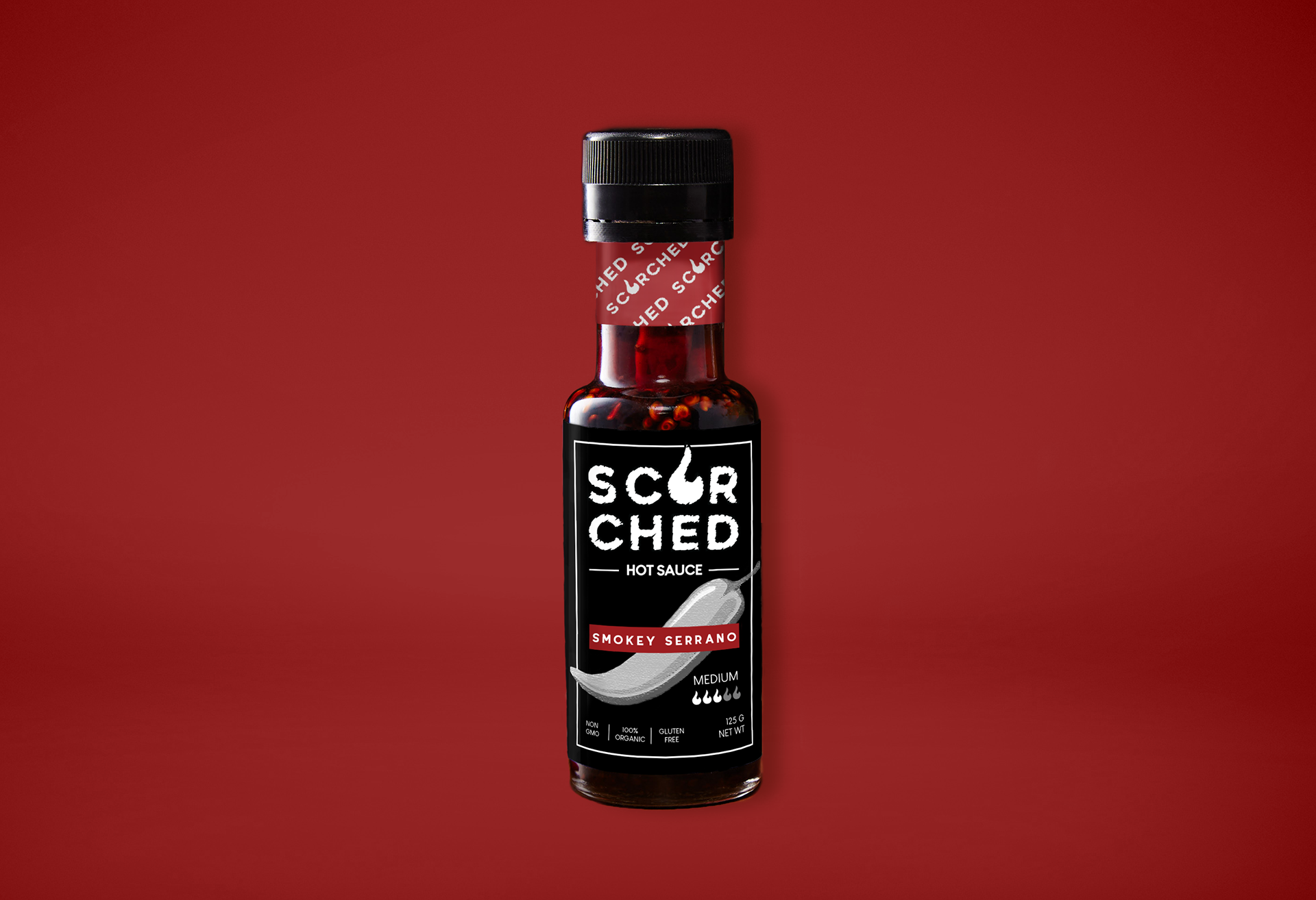
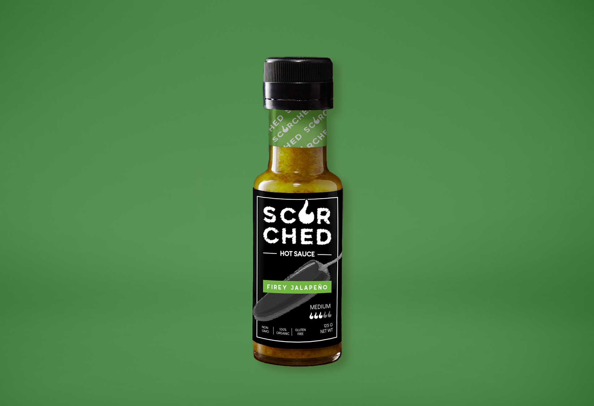
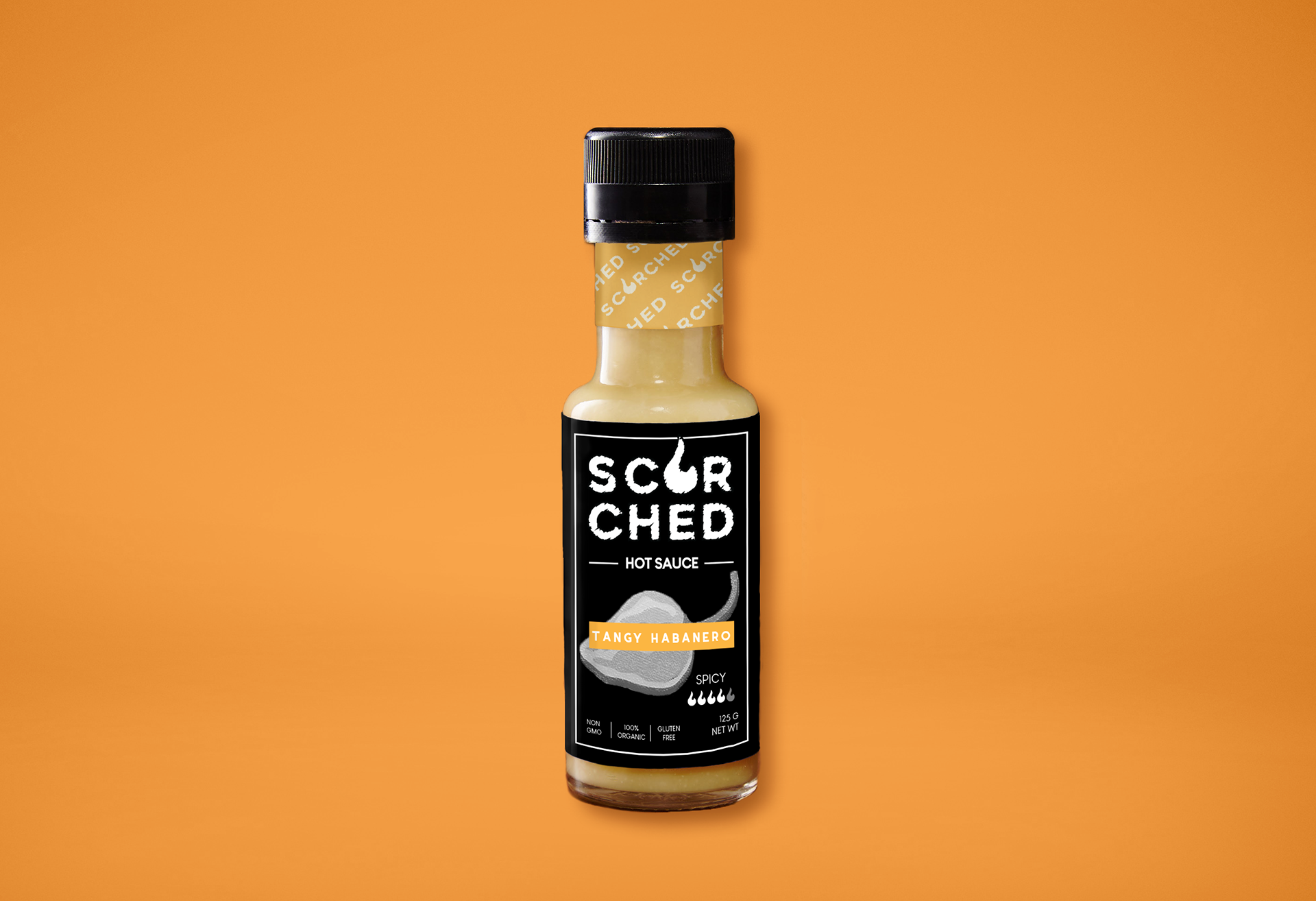
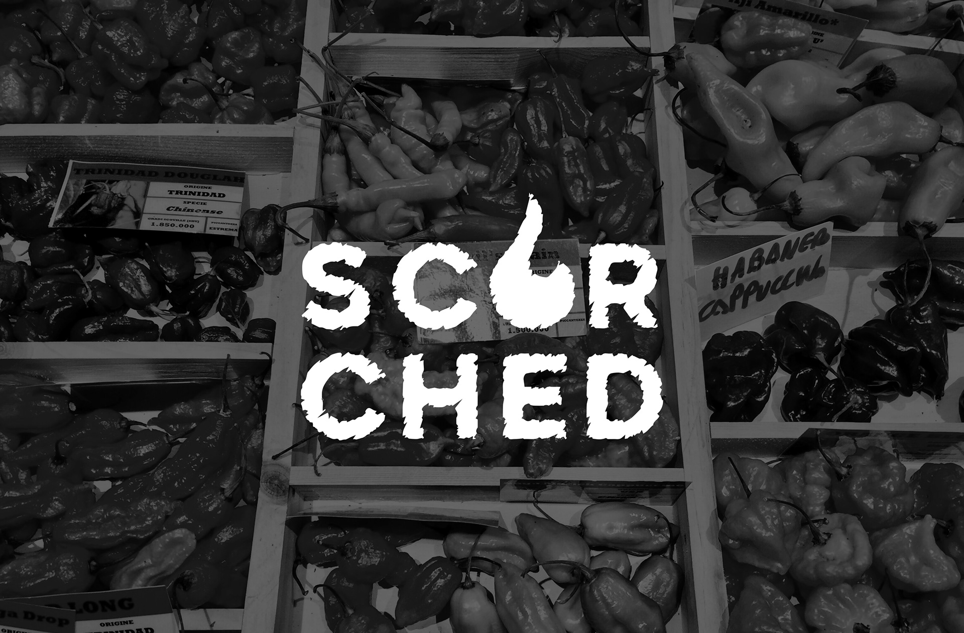
Scorched is a fictional hot sauce brand created for a class project focused on packaging design. For this project, the objective was to create an eye-catching logo and packaging design that could stand out in any supermarket isle.
Playing on the name Scorched, I created a bold, dynamic, and visually striking logo incorporating a fiery font to convey heat and intensity. I also replaced the "O" in Scorched with a fire symbol to further emphasize the branding. The color palette predominantly uses red, orange, green and black to symbolize fire and heat. With this, Scorched is a hot sauce that is sure to ignite your senses.
![](https://cdn.myportfolio.com/d2e35a92-8738-49c9-ac77-0d093d17d1e9/5bf80920-97f8-455b-89c9-61d70e9ddc1a_rw_1920.jpg?h=46701e4e21970d313d34c3d30e891a90)
![](https://cdn.myportfolio.com/d2e35a92-8738-49c9-ac77-0d093d17d1e9/d5fcde96-6e6f-4eee-82e3-43aae4b9b2f1_rw_1920.png?h=2156655daeec4775a40067baae5478c0)
![](https://cdn.myportfolio.com/d2e35a92-8738-49c9-ac77-0d093d17d1e9/16d3d4e1-8f20-4448-a76e-7510bf8b6b26_rw_1920.png?h=5c5717b12bac6638c7124871799781b5)
![](https://cdn.myportfolio.com/d2e35a92-8738-49c9-ac77-0d093d17d1e9/89076fa7-7314-4103-b5e8-2fe3c462396b_rw_1920.png?h=ebf623fee65b2b1c4bcb8be00a5e475e)