Step into nostalgia: Reviving 90s Cartoons with Redesigned Logos
Welcome to my little design space where I nerd out about 90s cartoons and give their iconic brands a modern makeover.
Starting off this series with my all time favorite cartoon, Spongebob Squarepants! I bring the beloved brands from Bikini Bottom to life using current design trends, brand identity principles, and play with typography, carefully selecting typefaces that capture the essence of the brand while infusing them with a contemporary style. I explore what these brands would look like if they came to real life!
Whether you're a die-hard 90s cartoon fan like me or a design enthusiast looking for inspiration, check out some of my work below and follow my socials for some more behind the scenes!
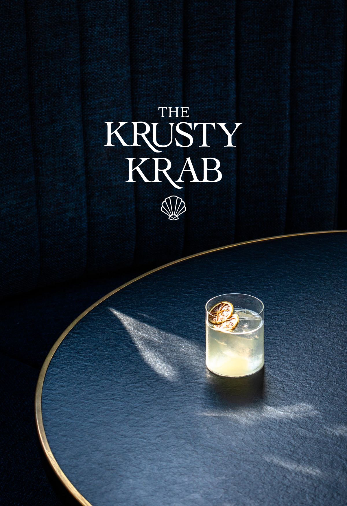
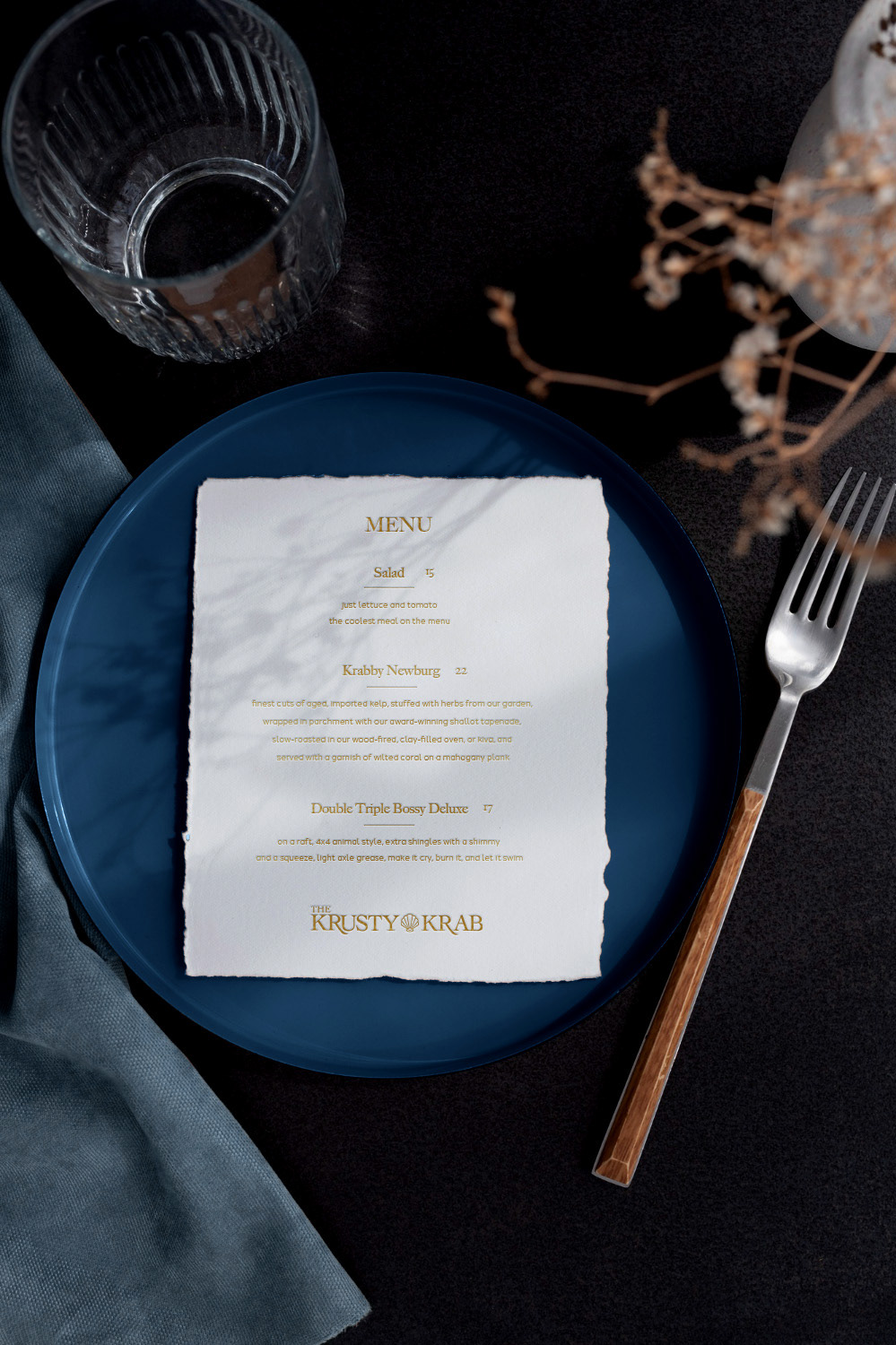
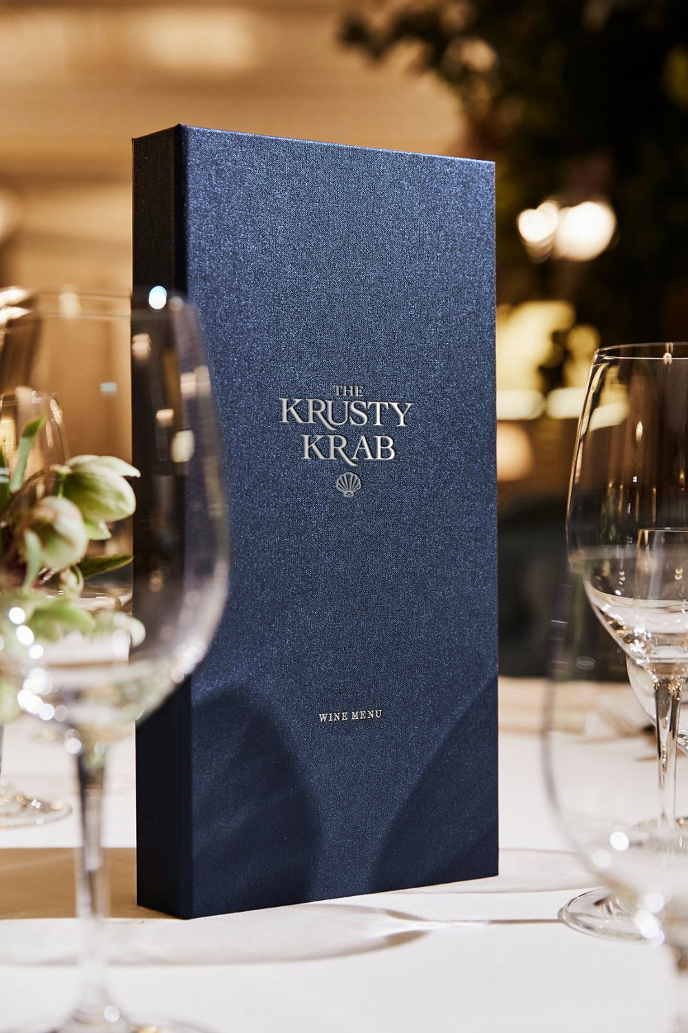
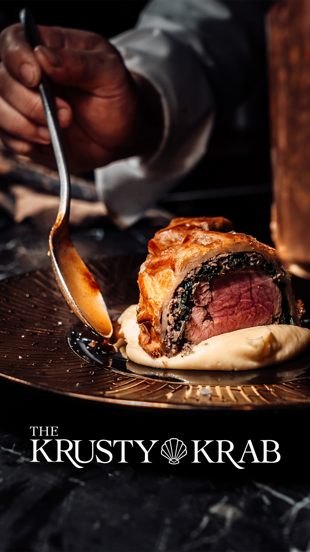
When creating the branding for the Krusty Krab, I wanted to play on the idea of what it could look like if it was one of the most upscale restaurants in town flaunting elegance and exclusivity. This led me to choose a color palette using deep navy blues with hints of gold to evoke luxury and harmony.
For the logo, I used the serif typeface Cochin and made some modifications to add a touch of sophistication. Lastly, I included a minimal shell icon to help balance out the logo and give a nod to the OG logo. Featuring elegant decor, soft lighting, and a quiet ambiance, the Krusty Krab would definitely deliver an upscale dining experience.
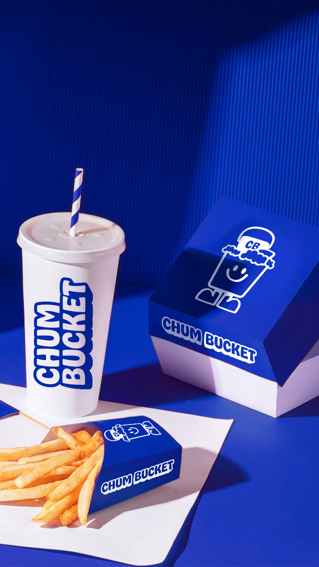
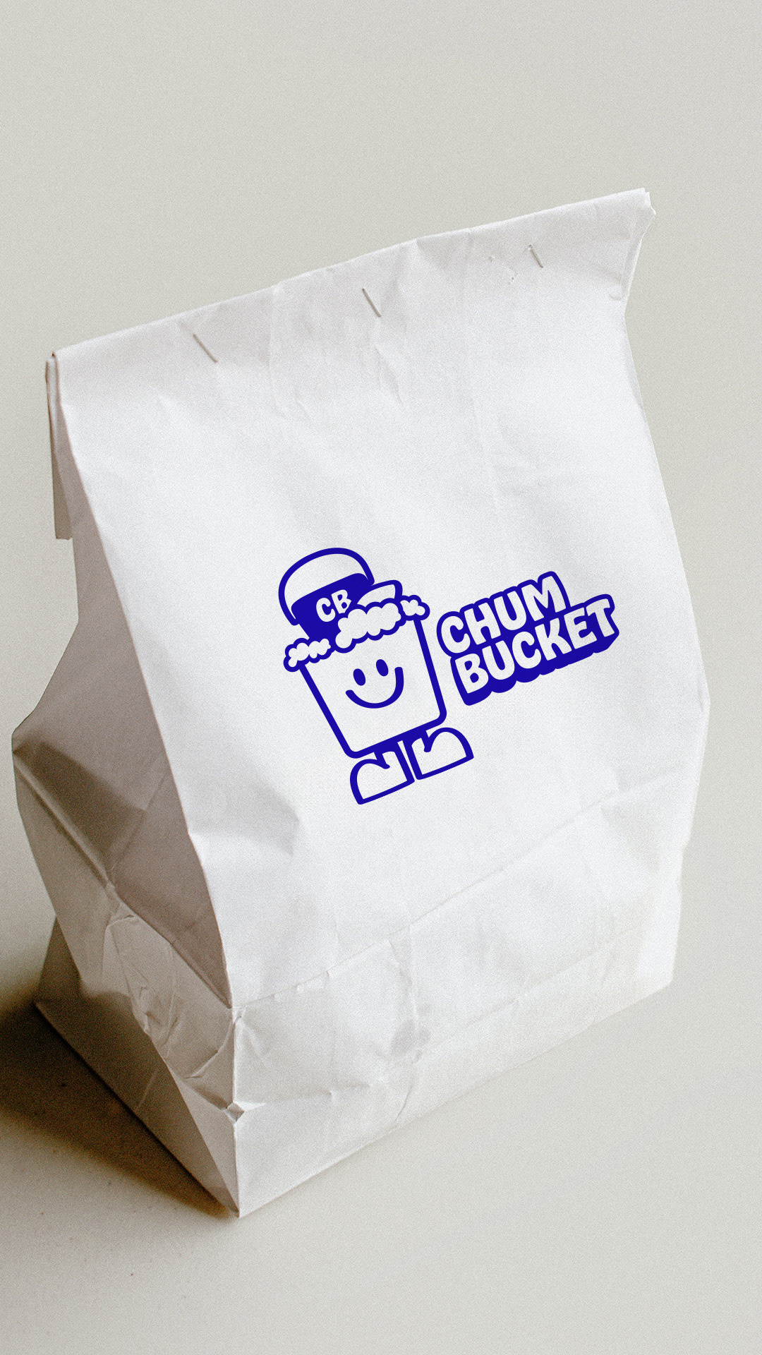
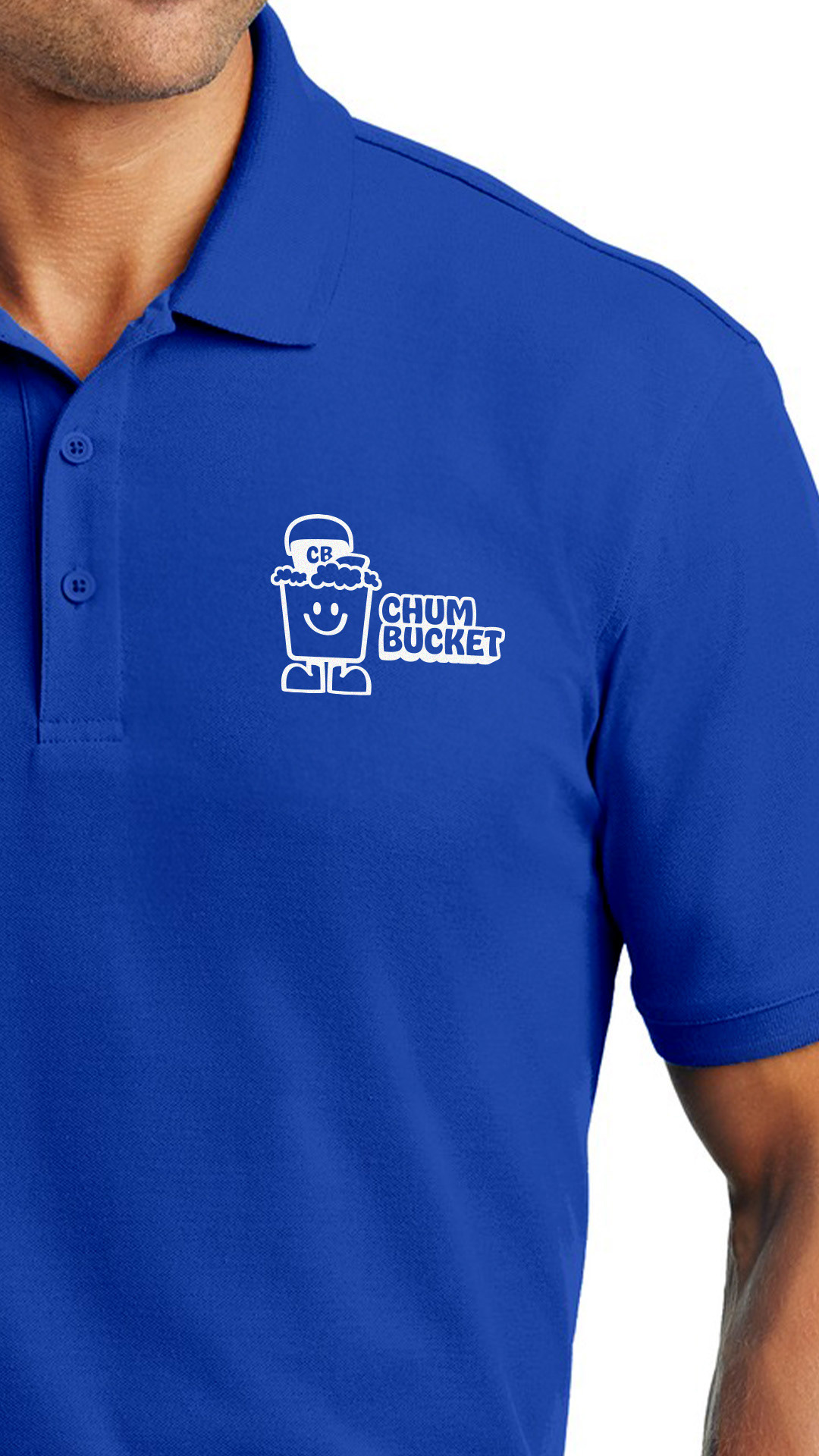
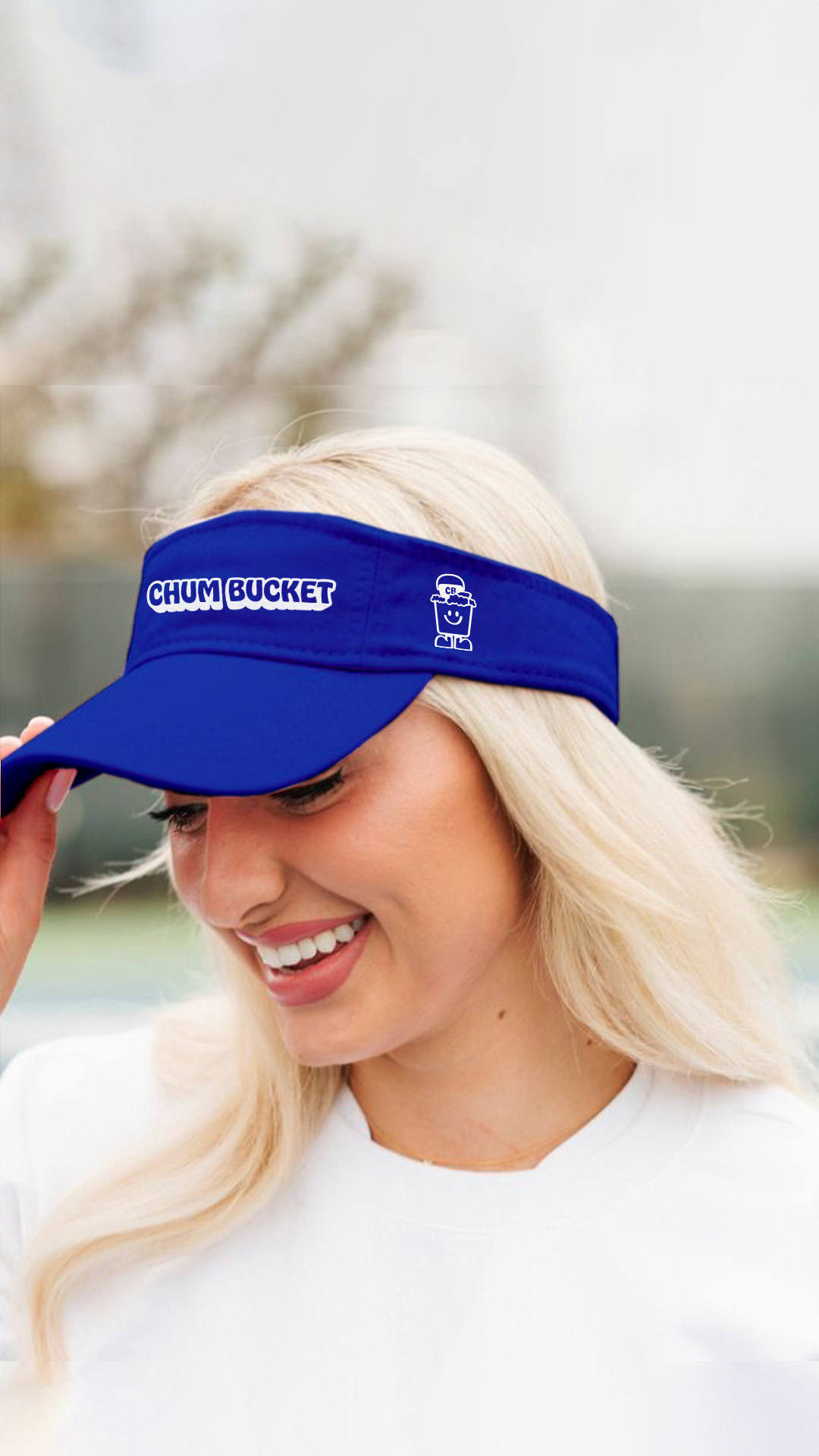
To create the branding for the Chum Bucket, I was inspired by the bold bright colors of fast food chains and positioned it amongst brands like Wendy's, Burger King, and McDonalds. To stand out from the rest, I chose a bold, attention-grabbing cobalt blue as the primary brand color that reflects the energy and excitement of the brand.
For the logo design, I created a simple yet recognizable, and versatile design, making it easily scalable for various applications. The typeface I used for the wordmark is Hobeaux, a more refined version of the original Hobo typeface that was designed in 1910 by Morris Fuller Benton. This San-Serif font was the perfect match to go with the brand Mascot, "Chum" the Bucket. With his approachable look and friendly face, this brand mascot evokes a sense of playfulness and fun that the Chum Bucket is sure to embrace.
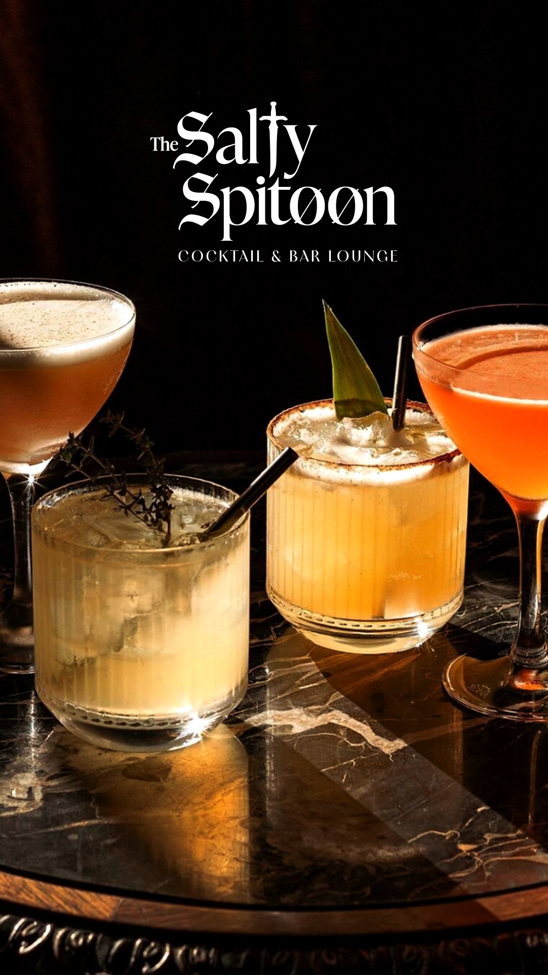
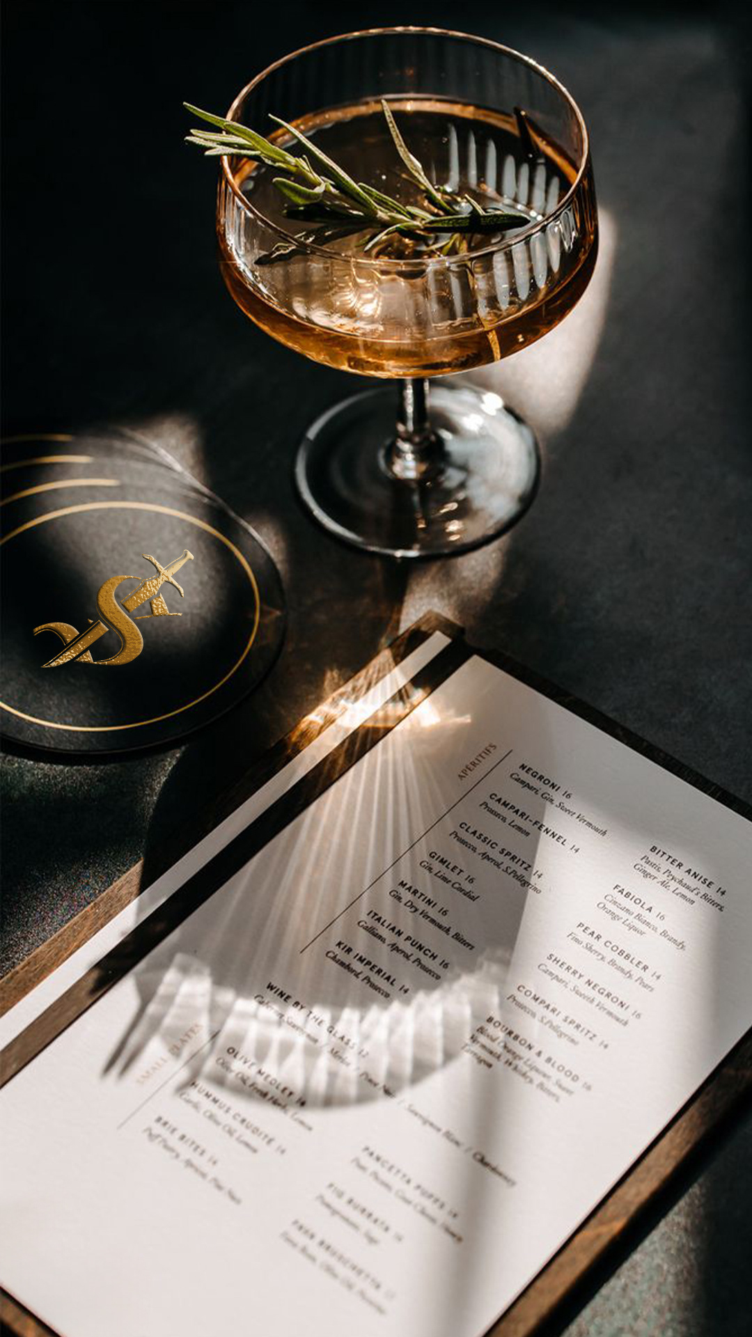
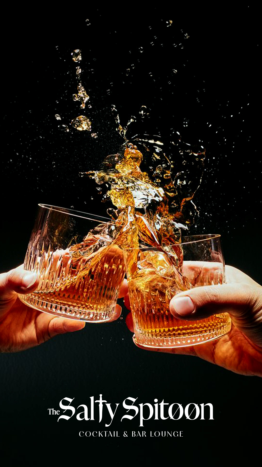
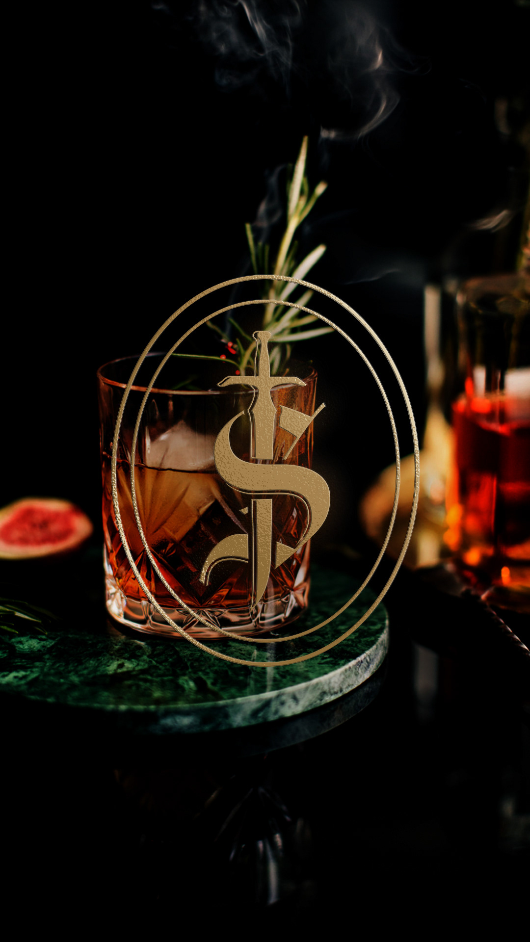
For the toughest bar in town, I rebranded the Salty Spitoon into a luxury cocktail and bar lounge that exudes lavishness and style. Inspired by the speakeasy bars of the 1920s, I imagine this cocktail lounge to have a low-lit atmosphere with vintage decor, antique furniture, and elegant barware.
For the typography, I combined Amador, IvyPresto Display, and Contralto Big Light to create a unique logo that reflects elegance and style with a hint of masculinity. In addition, I created a monogram featuring a dagger to maintain that rouged yet luxurious and sophisticated style. For printed collateral, metallic foils and embossed finishes would be used to elevate the value of the brand that much more. With this, I'm sure the Salty Spitoon would be the go to bar for any discerning patrons seeking a luxurious and sophisticated cocktail lounge experience.
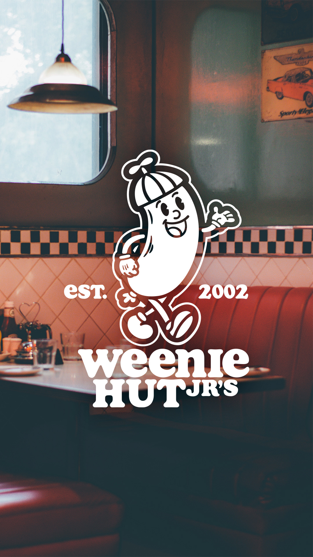
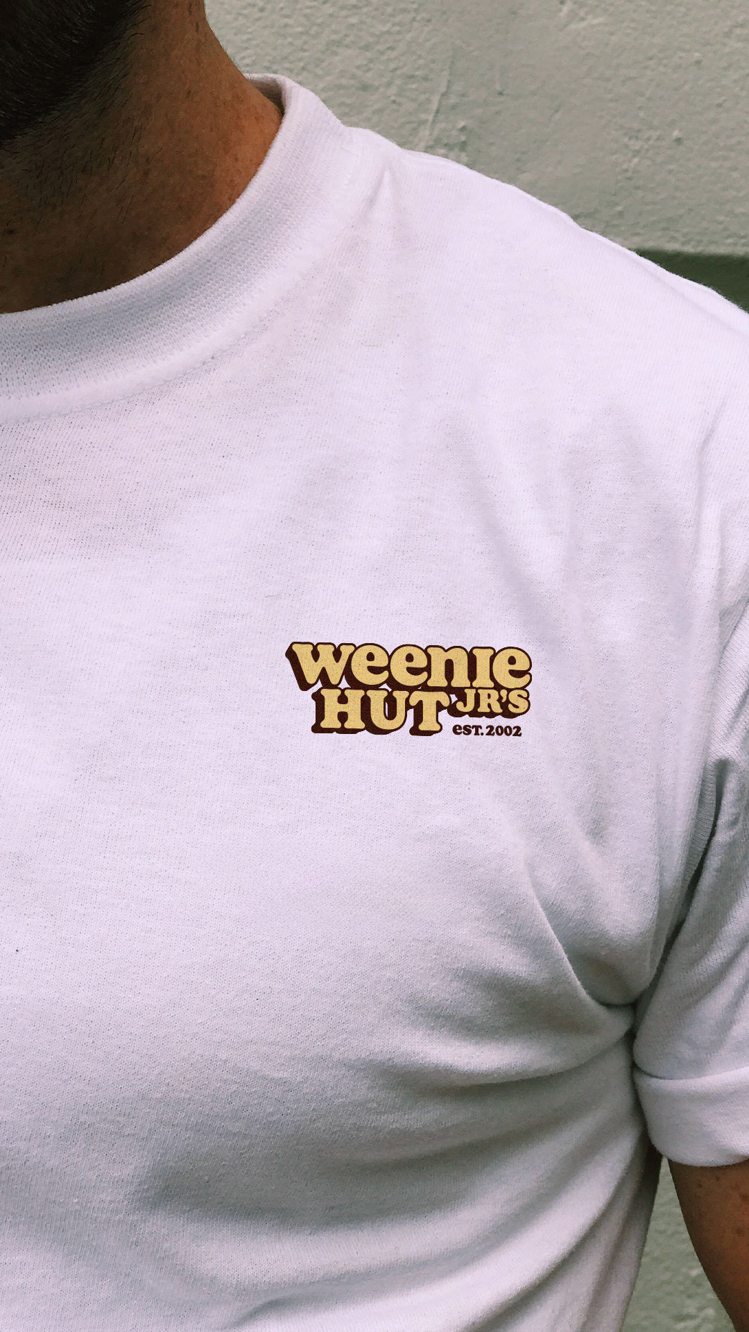
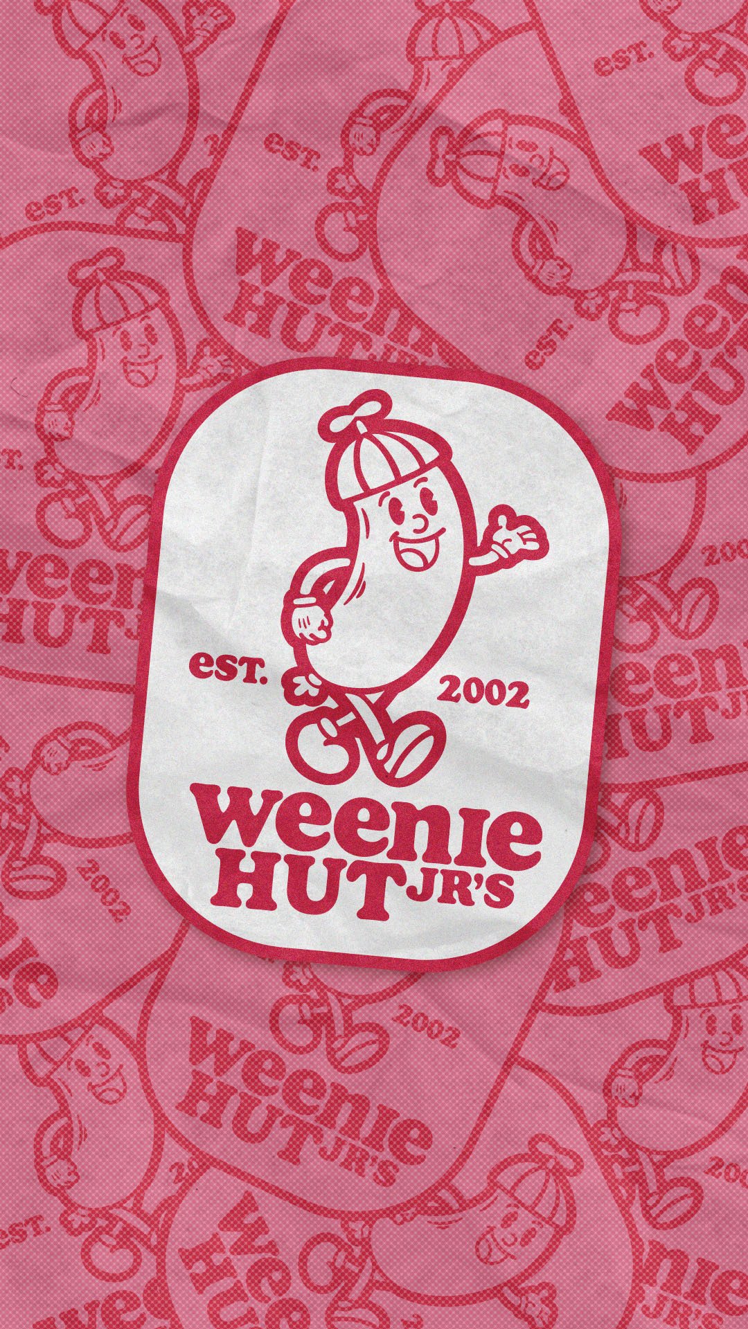
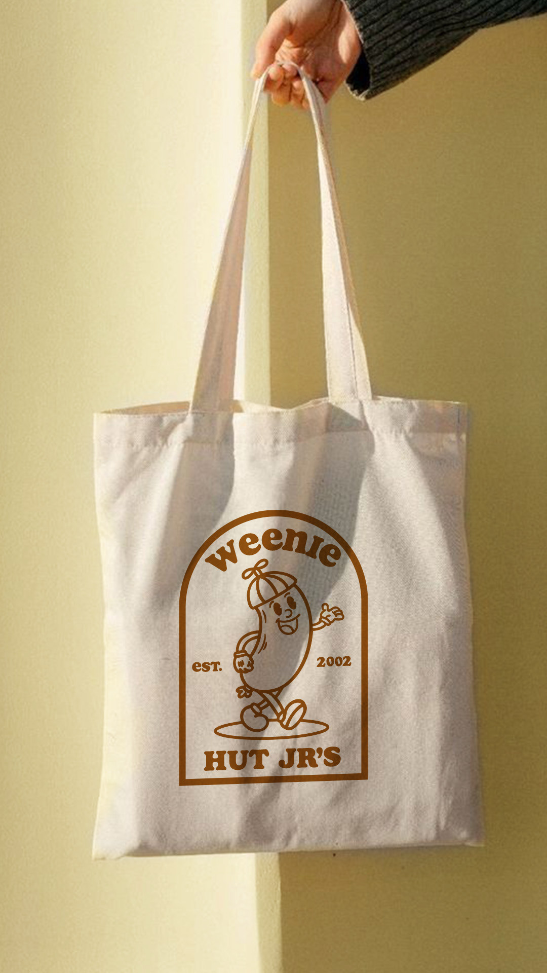
Across the street from the Salty Spitoon you'll find Weenie Hut Jr's, a retro diner capturing the playfulness of the 1950s and 1960s era while maintaining a contemporary appeal. I imagine this diner's interior to be filled with vintage memorabilia, chrome accents, checkerboard floors and vinyl booths.
For the logo design I used Soap, a modern twist on the classic Cooper Black typeface which was heavily used and popularized during the 1960s. I also revamped the hot dog mascot from the original logo with a quirky and fun illustration reminiscent of 1950s cartoons. For the color palette, I chose a combination of pastel colors featuring shades of brown, yellow, and red to further evoke a sense of nostalgia. All together, this makes for a cohesive brand identity that is sure to appeal to the vinyl record lovers looking for some delicious comfort food.